


Product Overview
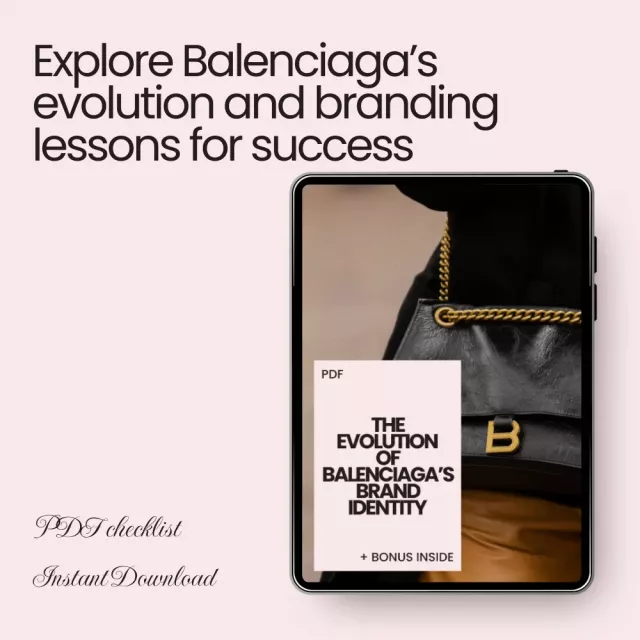
Discover the fascinating journey of one of fashion’s most iconic brands in The Evolution of Balenciaga’s Brand Identity. This insightful eBook takes you through the brand’s remarkable transformation, from its elegant beginnings under Cristóbal Balenciaga to its cutting-edge reinventions today under Demna Gvasalia. Whether you’re a fashion enthusiast, a creative professional, or a brand strategist, this guide offers valuable insights into Balenciaga’s evolution, making it a must-have for anyone interested in high-fashion branding, cultural influence, and iconic campaigns.
Key Features & Contents
- The Origins of Elegance – A deep dive into the early history and legacy of Cristóbal Balenciaga.
- Signature Styles That Defined the Brand – Explore the unique elements that shaped the Balenciaga brand identity.
- Reinvention Under New Leadership – An overview of the changes under new creative directors like Nicolas Ghesquière and Demna Gvasalia.
- Logo, Typography, and Visual Language – A look at how the brand’s visual identity evolved over time.
- Cultural Impact and Collaborations – Understanding the brand’s influence on fashion, celebrity culture, and the streetwear revolution.
- Case Studies: Iconic Campaigns – In-depth analysis of key Balenciaga campaigns like the Triple S Sneakers Launch and the “Balenciaga Ghost” Collection.
- Using AI to Explore Brand Identity – Tools and prompts for leveraging AI tools like ChatGPT and MidJourney for creative exploration.
- Exercises to Experiment with Identity – Practical steps for creatives and marketers to apply Balenciaga’s lessons to their own brand strategies.
Why You Need This Guide
If you’re looking to understand the Balenciaga brand identity evolution and its pivotal role in shaping modern fashion, this eBook is an essential resource. Not only does it cover the brand’s major milestones, but it also provides real-world case studies, design insights, and branding strategies that you can apply to your own work. From the rise of streetwear to the creative use of collaborations and viral campaigns, this guide equips you with the knowledge to better understand Balenciaga’s creative genius and its lasting influence on the fashion world.
Practical Benefits
- Gain valuable insights into how Balenciaga transformed its brand identity over the decades.
- Learn about the strategic decisions that helped Balenciaga become a global leader in fashion.
- Explore how AI can assist in branding and identity development.
- Implement key branding lessons from one of the most influential fashion houses in your own marketing strategy.
- Access free tools to further enhance your exploration of brand identity.
Who is This For?
This eBook is perfect for fashion lovers, marketers, creatives, and anyone interested in learning about the evolution of iconic brands. If you’re a designer, entrepreneur, or digital marketer, this guide will help you understand the power of branding and how to reinvent your own brand identity using the lessons from Balenciaga’s brand identity evolution.
Get Your Copy Today!
Ready to explore the remarkable journey of Balenciaga’s evolution? Download The Evolution of Balenciaga’s Brand Identity today and start mastering the art of brand transformation. Whether you’re looking to revamp your own brand or simply appreciate the genius of Balenciaga, this eBook is a must-have in your digital library.
Order cancellation
All orders can be cancelled until they are shipped. If your order has been paid and you need to make a change or cancel an order, you must contact us within 12 hours. Once the packaging and shipping process has started, it can no longer be cancelled.
Refunds
Your satisfaction is our #1 priority. Therefore, you can request a refund or reshipment for ordered products if:
- If you did not receive the product within the guaranteed time( 45 days not including 2-5 day processing) you can request a refund or a reshipment.
- If you received the wrong item you can request a refund or a reshipment.
- If you do not want the product you’ve received you may request a refund but you must return the item at your expense and the item must be unused.
We do not issue the refund if:
- Your order did not arrive due to factors within your control (i.e. providing the wrong shipping address)
- Your order did not arrive due to exceptional circumstances outside the control of legendarypicksmarket.shop (i.e. not cleared by customs, delayed by a natural disaster).
- Other exceptional circumstances outside the control of https://legendarypicksmarket.shop
*You can submit refund requests within 15 days after the guaranteed period for delivery (45 days) has expired. You can do it by sending a message on Contact Us page
If you are approved for a refund, then your refund will be processed, and a credit will automatically be applied to your credit card or original method of payment, within 14 days.
Exchanges
If for any reason you would like to exchange your product, perhaps for a different size in clothing. You must contact us first and we will guide you through the steps.
Please do not send your purchase back to us unless we authorise you to do so.
Instant download
Your purchase will be available to download once payment is confirmed.
Instant download items don’t accept returns, exchanges or cancellations. Please contact us if you have any problems


The logo evolution breakdown — from cursive serif to bold sans-serif — gave me a framework I immediately applied to a client rebrand. Watching how Balenciaga stripped ornamentation while keeping recognizability was the exact case study I needed for a pitch deck I'd been stuck on.
The Ghesquière-to-Demna transition is the clearest example I've seen of how creative leadership reshapes brand identity without erasing heritage. I run a small design studio and I've been struggling with how to modernize a legacy client's look without alienating their base. This PDF walked me through the exact tension — futuristic edge vs. architectural roots — and how Balenciaga resolved it. I used the exercises at the end to sketch three logo variations for the client, and they picked the one that most closely followed the serif-to-geometric approach described here. The packaging section also prompted us to rethink our client's unboxing experience entirely.
Triple S case study alone justified the download.
The packaging evolution from embossed boxes to matte industrial textures was a detail I hadn't considered before
Tight, well-structured, and actually useful for brand strategy work.
The overextension risks section names exactly what went wrong with a brand I consulted for last year. Too many product lines, too fast, no strategic alignment. Reading it felt like a postmortem I should have written myself. The lesson about balancing innovation with heritage is deceptively simple but hard to execute — this guide makes it concrete.
Solid foundation but the Ghesquière era felt compressed. He led the brand for fifteen years and the guide covers him in a couple of paragraphs while Demna gets more room. The innovative fabrics and asymmetrical cuts deserve deeper treatment — that era is what made the Demna shift possible. The visual language and typography sections are where this really shines though.
The MidJourney prompt for a futuristic boutique interior was surprisingly effective — used it same day.
How a single sneaker redefined an entire house's perception — that's the kind of case study I wish more branding guides included.
⭐
The exercises at the end turned this from passive reading into something I actually did. Sketching my logo in three different eras forced me to think about my own brand's trajectory in a way I'd been avoiding. The campaign scenario exercise using irony was harder than expected but opened up creative directions I wouldn't have explored otherwise.
Cultural relevance being as crucial as design heritage — that reframe stuck with me.
Good overview for marketers new to luxury branding, but the cultural impact section could dig further into how the Crocs collaboration specifically generated buzz. Mentioning it without unpacking the mechanics of why it went viral leaves a gap. The branding mistakes section partially compensates — the misaligned marketing warnings are sharp and practical.
The color palette shift from neutral to stark black-white-neon contrasts told a bigger story than I expected.
I'm a creative director at a mid-size agency and I handed this to three junior designers as required reading. The way it traces Balenciaga's visual language from ornate couture cues to stripped-down minimalism gives them a reference point for understanding how identity systems evolve over decades. The typography section — serif fonts for sophistication versus geometric fonts for power — became shorthand in our team meetings within a week.
Balloon skirts, cocoon coats, tunics — the early innovation context matters more than most people realize.
The Ghost collection case study is fascinating but underdeveloped. Logo-emblazoned office supplies and furniture as fashion commentary — that concept deserves a full breakdown of audience reception and sales impact, not just a paragraph. The Triple S analysis is much stronger. Overall the guide leans toward surface-level coverage on its most interesting material while doing solid work on the foundational sections.
Proportion and balance over ornamentation — Cristóbal's original philosophy still holds up as brand advice.
Read it on a train, finished before my stop, and already had notes for Monday's strategy meeting.
The AI prompts section gave me usable starting points I adapted for three different client projects. The ChatGPT prompt about writing a Gen Z sneaker launch campaign was particularly good — I modified it for a different product category and the output was strong enough to build a real brief around.
⭐
The way this connects San Sebastián origins to modern raw-material store design is a masterclass in threading heritage through reinvention. I teach a brand strategy course and the Balenciaga timeline here — 1919 couture to Demna's meme-culture campaigns — will become part of my curriculum next semester. The packaging evolution alone is worth assigning as a case study. Students always underestimate how touchpoints like boxes and retail layouts reinforce identity, and this PDF makes that tangible. I also appreciated that the exercises aren't throwaway prompts — the audience reflection exercise using surveys is exactly how I want students thinking.
Misaligned marketing approaches section — printed it and pinned it above my desk.
Decent branding primer but it reads more as an overview than a deep dive. For anyone already familiar with luxury brand strategy, the cultural impact section covers territory that's been discussed extensively elsewhere. Where it adds value is in the exercises and AI tools — those are practical and fresh. The Looka recommendation for logo experimentation was new to me and I've already started using it.
Campaigns leveraging irony and meme culture — the guide names the strategy without fully dissecting it. I wanted more on how tone varies across markets and why absurdist humor lands differently in Europe versus Asia. That said, the overextension warnings are sharp, and the lesson about collaborating without strategic alignment is one I've seen brands ignore at real cost.
The store design evolution section made me rethink our own retail experience entirely.
Wearable art versus seasonal fashion — that distinction reframed how I approach product positioning
I manage brand identity for a DTC label and this guide helped me articulate something I'd been feeling but couldn't name — the tension between staying true to your roots and staying relevant in a feed-driven world. The Demna section showed how streetwear aesthetics and digital-native campaigns brought in a younger audience without erasing the couture DNA. I used that as a template for a brand refresh proposal last month and the client approved it on the first pass. The before/after was dramatic: our social engagement went from stagnant to growing 15% month over month once we adopted a similar contrast-driven visual identity.
Clean structure, no padding, respects your time.
Four exercises that actually push you to apply the material instead of just nodding along.
The guide does a better job covering visual identity than marketing strategy. Typography and logo evolution sections are detailed and well-argued. But the viral campaigns section glosses over execution mechanics — how did the digital campaigns actually get distributed, what was the media spend, what platforms performed best? Without those details the case studies read more like summaries than actionable analysis.
Balenciaga moving from Paris couture boutiques to open-layout raw-material stores — that's brand identity made physical.
The Canva AI and DALL·E free tier suggestions lowered the barrier for me to start experimenting. I'd been putting off mood board work because I assumed I needed expensive tools. Generated five brand-direction visuals in an afternoon using the MidJourney prompts from the guide, then ran the audience reflection exercise with a quick Instagram poll. The whole workflow took less time than one traditional brainstorming session.
❤️⭐
How leadership reshapes a brand while keeping its DNA intact — that one line summarizes the whole guide.
The two leadership eras are well-contrasted but I wish the guide explored what happened between 2012 and 2015 when the creative director seat was in transition. That gap period matters for understanding how brand identity holds during leadership vacuums. The logo and typography analysis is the strongest section and I've referenced it in two client presentations already.
Shared the exercises section with my entire marketing team — we're doing the logo evolution sketch this Friday.
The point about growth balancing innovation with heritage is simple but it's the one thing most startups get wrong.
Useful as a reference doc I keep coming back to, not just a one-time read.
The visual language section is genuinely the best part. Tracking the color palette from understated neutrals to stark black-white-neon contrasts shows how intentional every shift was. I'm a graphic designer and I've seen too many rebrands that change colors arbitrarily — this guide shows what it looks like when palette shifts actually serve a strategic purpose.
Readable, strategic, zero filler — rare combination for a brand PDF.
The Crocs collaboration mention needed more detail. Saying it generated global buzz without explaining the mechanics of how an intentionally ugly shoe partnership elevated rather than diluted the brand feels like a missed opportunity. Still, the overextension warnings in the mistakes section implicitly address this — collaborating without alignment can backfire, and the Crocs case is the exception that proves the rule.
Sculptural silhouettes as brand DNA dating back to 1919 — that historical thread makes the modern identity feel earned, not manufactured
The campaign scenario exercise using irony pushed me out of my comfort zone in a productive way.
I picked this up expecting a surface-level brand overview and ended up overhauling my entire approach to visual identity for a sneaker startup I advise. The Triple S case study — showing how one product redefined brand perception through limited releases and social media hype — became the foundation of a launch strategy we're executing this quarter. The misaligned marketing section also saved us from a campaign concept that leaned too hard on irony for a market that wouldn't have received it well. We tested the audience reflection exercise with focus groups and caught the issue before spending any media budget.
Matte boxes and minimal typography as brand signals — never thought about packaging that way before.
The AI section covers more ground than expected for a branding PDF. Looka was a new find for me.
Good content overall but the three-star reviews in my head come from wanting deeper competitor analysis. How does Balenciaga's identity evolution compare to Gucci's or Bottega Veneta's during the same period? The guide treats Balenciaga in isolation, which limits how transferable the lessons feel. The exercises partially fix this by forcing you to apply the framework to your own brand, but a brief competitive lens would strengthen the whole argument.
Proportion over ornamentation — Cristóbal knew something most modern brands still haven't figured out.